The business world seems to have suddenly realized that Branding is an integral part of the Business Strategy. 2019 is fast becoming the year of the rebrand as major companies rediscover its importance.
Brands live and die by their images. Experimentation and innovation help brands to remain dynamic and on Top-of-Mind with customers. But any decision to rebrand is fraught with risks as well. For every rip-roaring success, such as Burberry or Old Spice, there’s a catastrophe such as GAP.
Get it right and you could open up new markets and revitalise an ageing brand; get it wrong and you could be on a very rocky path indeed.
 |
| Top Five Rebrands of 2019 |
2019 has been a busy year for the rebrand with some of the corporate world’s biggest names getting in on the act. Some have worked better than others, but here are five which Oudney's Studios think to seem to have got it to spot on:
1. Discovery Channel: Never before has the TV market been more competitive. With Netflix edging into its nature documentary territory, Discovery has been upping its game with fresh branding and new partnerships.
Its logo has become much simpler. Gone is a photo-realistic planet Earth replaced with a smaller monochrome globe which fits neatly into the letter D. In its animated form, the globe spins within the D. They have also made the most of the open D design in all their other collateral to frame its stunning photography.
The rebrand supports a more ambitious strategy which includes talks with BBC for a partnership on nature documentaries. It is bold, minimalistic and projects an image of a confident brand with a global presence.
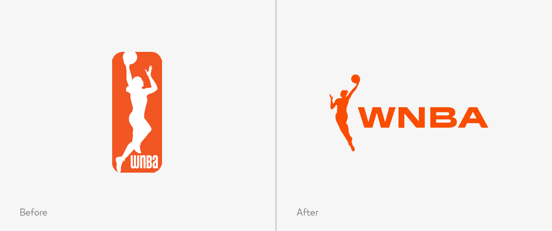
2. WNBA: Established in 1996, the WNBA has already been highly successful with its previous logo designed by the Original Champions of Design. Their new one builds on it rather than embarking on a bold new direction. It is a simpler, free-flowing form.
The old one featured a box surrounding the silhouette of a female basketball player. This is gone and the figure has been redrawn giving it a simpler, almost balletic, appearance. The intention is to create something which looks smoother, more elegant and is in keeping with the league’s motto: ‘This is basketball on our terms’.
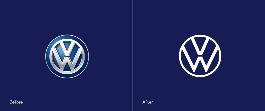
3. Volkswagen: The traditional Volkswagen logo has been with us for as long as anyone can remember, but the arrival of what the company calls a ‘new era’ has ushered in a flat, digital first alternative. The basic structure is the same, but a 3D logo, with a chrome effect, has been replaced with a stark 2D monochromatic version.
The new logo is part of a much wider rebirth of a company which has had a difficult few years after it was caught cheating emissions tests. Alongside a new logo and fresh look, therefore, comes the launch of a fully electric line of vehicles called the ID.3. This brand is all about a new start, placing the company at the forefront of a modern, cleaner automotive industry.
4. Staples: The secret of a great rebranding exercise is to refresh your image while retaining the best of what made the old one great. Few have managed this quite as well as Staples.
The old logo was familiar and much loved with its quirky wonky staple forming an L.
That has gone with a much cleaner font, against what could be a desk or a staple. It manages to become more professional while retaining the friendly and accessible nature of the original.
The rebrand is far-reaching across the company as it attempts to modernise itself into a retailer which helps people manage their work-life balance. It has adopted the hashtag #worklifesolutions and has launched a number of private-label brands including NXT Technologies, which produces wireless gadgets, and Tru Red which offers notebooks and pens.
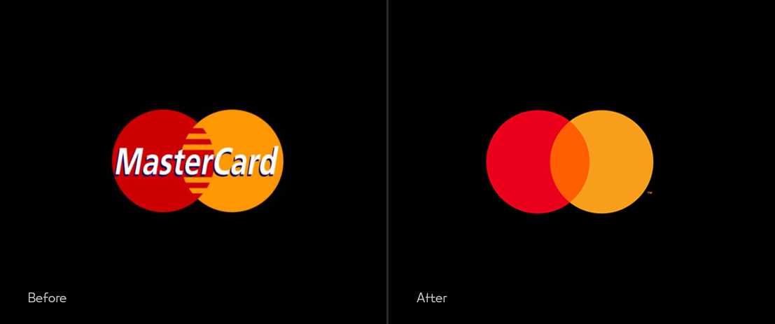
5. Mastercard: Earlier this year Master Card moved into the league of Apple, Nike, Target, and others and showed the confidence to drop its name from the Logo. Now the logo just contains the red and yellow overlapping circles in selected contexts.
Brands that opt this visual route eludes the sense of confidence that they have made the mark in the minds of their consumers and don’t need the support of text to be recognized. Only icons can play in this space and it’s not something which a young brand should experiment.
Even Mastercard is not planning to implement the change across all touchpoints. They will continue to use the word “MasterCard’ in emerging markets and in Corporate and B2B communications. However, this rebranding suggests that MasterCard is shifting its brand strategy to equip itself for the digital banking era.
What about your brand? Do you have a strong branding strategy? Does your brand reflect all your values and convey the right message to your target customers, building trust with them and inspiring their long-lasting loyalty?
Oudney's Studios, is a leading branding and advertising agency in Zimbabwe with a team of in-house experts who know how to make brands impressive and help them stand the test of time. Feel free to request a quote or contact us via email or phone and we’ll be more than happy to help you tell your brand story.
 |
| Top Five Rebrands of 2019 |
The rebrand supports a more ambitious strategy which includes talks with BBC for a partnership on nature documentaries. It is bold, minimalistic and projects an image of a confident brand with a global presence.
2. WNBA: Established in 1996, the WNBA has already been highly successful with its previous logo designed by the Original Champions of Design. Their new one builds on it rather than embarking on a bold new direction. It is a simpler, free-flowing form.
 |
| Top Five Rebrands of 2019 |
The old one featured a box surrounding the silhouette of a female basketball player. This is gone and the figure has been redrawn giving it a simpler, almost balletic, appearance. The intention is to create something which looks smoother, more elegant and is in keeping with the league’s motto: ‘This is basketball on our terms’.
3. Volkswagen: The traditional Volkswagen logo has been with us for as long as anyone can remember, but the arrival of what the company calls a ‘new era’ has ushered in a flat, digital first alternative. The basic structure is the same, but a 3D logo, with a chrome effect, has been replaced with a stark 2D monochromatic version.
 |
| Top Five Rebrands of 2019 |
4. Staples: The secret of a great rebranding exercise is to refresh your image while retaining the best of what made the old one great. Few have managed this quite as well as Staples.
The old logo was familiar and much loved with its quirky wonky staple forming an L.
That has gone with a much cleaner font, against what could be a desk or a staple. It manages to become more professional while retaining the friendly and accessible nature of the original.
 |
| Top Five Rebrands of 2019 |
5. Mastercard: Earlier this year Master Card moved into the league of Apple, Nike, Target, and others and showed the confidence to drop its name from the Logo. Now the logo just contains the red and yellow overlapping circles in selected contexts.
Brands that opt this visual route eludes the sense of confidence that they have made the mark in the minds of their consumers and don’t need the support of text to be recognized. Only icons can play in this space and it’s not something which a young brand should experiment.
 |
| Top Five Rebrands of 2019 |
What about your brand? Do you have a strong branding strategy? Does your brand reflect all your values and convey the right message to your target customers, building trust with them and inspiring their long-lasting loyalty?
Oudney's Studios, is a leading branding and advertising agency in Zimbabwe with a team of in-house experts who know how to make brands impressive and help them stand the test of time. Feel free to request a quote or contact us via email or phone and we’ll be more than happy to help you tell your brand story.